Category Archives: Web Content

What exactly is “content”?

What exactly is content?

We are constantly using terms like content marketing, content writing, content strategy, SEO content, social media content and so on, but what exactly is content?

People who write think that what’s written (text) is content. Those who produce videos think that videos are the content. The ones who deal with images think that it’s the images that make a major chunk of content. So if you have a blog where you’re constantly writing about your business the text that you have written for your blog is content for it. If you’re posting videos that are somehow related to your business, your products or services on YouTube then it’s video content. If you find your muse on Pinterest than images are your content. What you have written on your homepage, the images that you have used and if you also have animations and videos on it, they all constitute content. The product descriptions and service descriptions are a part of your content and so is your company profile and the “about us” section.

Everything existing on your website that communicates with your visitors, conveys something, elicits some response, is content.

Why am I writing this?

Because people don’t take content seriously enough. They think they require content only to improve their search engine rankings so for them, content means publishing informative articles and blog posts. This is why they want to pay pittance to content writers and this is why content writers are ready to work for pittance: both have no idea how important content is.

You lose at 2 fronts if you don’t take your content seriously or if you don’t understand properly its significance:

  • You don’t optimize your existing content
  • You wrongly optimize the content that you get created for better rankings

So in the end you aren’t exactly gaining anything.

Have a close look at the content that you have on your website and this means, all the pages and not just blog posts and “SEO content”. Even streamlining your existing content can significantly improve your conversion rate and search engine rankings.

Is your website content mobile friendly?

Making your content mobile friendly

This issue has got nothing to do with elementary content writing, but with 47% searching for product reviews and 29% obtaining additional information on their mobile phones and 50% mobile users using their phones as primary Internet source (source – 2013 stats), not creating and tailoring your content for mobile users can make a big dent in your bottom line.

Personally – and I’m not sure how many people are doing this – when I come across a link on my mobile phone that I’d like to read properly I save it in Pocket and then later on either read it on my daughter’s iPad or on the computer. As the stats show above, most people don’t mind reading long texts on their mobile phone.

There are two aspects to creating mobile friendly content on your website: having a layout that seamlessly scales according to the screen-size, and content that is easier to read and comprehend on a smaller screen. The design aspect is controlled by your web designer (he/she should keep in mind the content-reading requirement of your visitors). How do you write or create content that is mobile-friendly?

There are three

ways of going about it; it depends on your priority. If not many of your visitors come from their mobile phones (you can find that out from Google Analytics) but still you don’t want to take chances, you can keep the same content for your computer users and mobile users, as long as your design is liquid and quickly scales according to the screen-size. For instance, that is, if you are reading this from your computer or laptop, reduce the width of your browser window and see how this web page turns into a single column layout below a certain width.

The second option is to recreate your content in such a manner that it’s easier to read it on all the devices.

Here are a few things you can consider:

  • Create shorter headlines: Shorter headlines don’t hog the precious real estate on the small screen and your user doesn’t have to scroll up-down or left-right in order to be able to read your headline and figure out what your page is about. Since most of the mobile users are in a highly distracted stage (you never know where they are when they are checking out your website) use clearer, smaller expressions so that they don’t have to use their minds much.
  • Use smaller paragraphs: If possible, just use one sentence per paragraph. This way it is easier to read text without straining the eyes and even if the font size is increased, the person doesn’t have to scroll up-down much in order to read the message confined within that paragraph.
  • Use bulleted points whenever possible:
    Bulleted points enable you to write in a concise manner without having to bother about complete sentences and other grammatical necessities. Due to smaller sentences (sometimes just a couple of words) it’s also easier for your readers.
  • Don’t make visitors click through multiple links: Linking is good, especially when you already have a webpage/blog post dealing with a particular subject and it doesn’t make sense to write about it again, but too much of it can create problems for your visitors. It’s not very easy to tap on hyperlinks on small screen and even when they tap on the links, coming back to the original page can be a great hassle. How do you avoid this hassle?
  • Create highly focused, vertical pages:
    When you create highly focused pages you don’t have to use many links. You are dealing with just a single topic. SEO experts advise you to link to as many pages from your website/blog from your current webpage/blog post as possible and if you want to follow such guidelines, go ahead, but make sure the message of your webpage/blog post doesn’t remain incomplete without having to tap those links.

The third option, a bit more time-consuming, is to create multiple versions of your content. This way you can serve all the segments of your visitors, whether they are accessing your website from their computers and laptops, tablets PCs or mobile phones. Just make sure you don’t end up creating lots of duplicate content.

With no keywords [100% (Not Provided)], is SEO content history?

Keyword data not provided

First of all, let me make it clear, there is no such thing as “SEO content”. You should always write content that is useful to your visitors, that provides the right information to your prospective customers and clients, and that is easily accessible. Stick to these guidelines and you have got “SEO content” on your website. Nonetheless, when you create content, you keep your primary keywords in mind while preparing the text. This is for obvious reasons. Up till now, the convention has been that if people are using certain words to find you, shouldn’t you be using those words? Suppose people are looking for content writing services, shouldn’t I use these three words as often as possible, while not overdoing it?

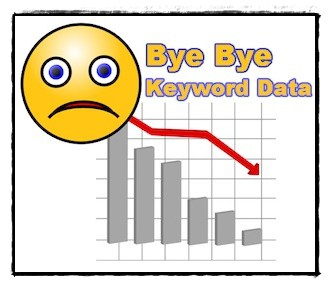
Recently Google has started encrypting every search – it means the various analytics programs that told you what keywords people are using in order to come to your website will no longer be able to do that. Here is an interesting take on this latest development:

Why does Google hide this valuable information in this awesome free tool called Google Analytics that they recommend you sign up for? Why do you think? My guess is it’s to encourage paid search engine marketing possibly through their Google AdWords product. I mean why else would you hide this useful information?

Whatever reasons Google has got, it is not going to show you the keywords for which you get traffic, and that’s that. It’s a big company, lots of businesses depend on it, and it can really take decisions that can wipe off smaller businesses just like that. Deal with it.

How do you deal with it? Most of my clients provide me a list of keywords when they want me to prepare content for them. Although more than keywords, what’s important is the message that is delivered through the content, but keywords are a big factor. You can use common sense to prepare content according to your main keywords. But how do you know that you are getting enough traffic for those keywords? If you are trying to optimize your website for multiple keywords, how do you know which keywords are already optimized for and which ones you still need some effort? In the absence of this insight, what sort of content do you create?

Google deciding not to show you keywords doesn’t mean that keywords no longer matter. After all it’s the keywords that people use in order to find the information they need. Although Google is shifting its focus on context rather than the words that you use – you may like to read my previous blog post titled Preparing your website content for Google’s Hummingbird algorithm. Despite that, keywords are going to matter and this is why…

The entire AdWords business depends on keywords because people bid on them. The advertisements on Google’s advertising network appear on the basis of the keywords people use to carry out searches. So do you want to know what keywords drive the most traffic to your website? Sign up for AdWords. Even if you are not interested in PPC advertising, you can use its PPC ad-creation tool to do research on keywords and find out the most relevant and the most widely used keywords in your industry. By spending some money you can also find out for which keywords people click your links the most.

The best thing to do is, stop worrying about keywords and start publishing content people find useful. In fact this can be a blessing in disguise. Almost since the beginning of the Internet businesses all over the world have depended on search engines for traffic. I’m not saying you completely start ignoring the search engines because millions of people use them to find products and services they need, but people are also using other sources like social networking websites, blogs, review websites and informative articles to make up their minds. In fact, trying to find good information on search engines can be like trying to find a needle in a haystack. On the other hand if you ask your peers, friends and followers (whether face-to-face or through your social connections on the Internet) you can find exactly the sort of information and advice you need. Start networking with people. Build your clout and authority. Improve your author rank instead of solely focusing on page rank and keyword density. Let people send traffic your way rather than search engines.

If you are not publishing a newsletter, then perhaps this is the right time to start one. Have a signup box somewhere on your website and encourage people to drop in their email ids so that you can keep in touch with them. In fact, the conversion rate from your emails is much higher compared to the traffic that you get from search engines.

Image source

A mobile responsive website layout is far better than creating separate websites

Having a mobile website is no longer an option; every website these days needs to look good and be easy-to-use on mobile devices, may it be tablets or smart phones.

Consequently, most of the websites have two versions. One layout for computers and laptops, and another for mobile devices, mostly of the type http://mobile.domainname.com.

Although this solves your purpose, you end up creating and maintaining two websites. This not only creates duplicate content (and hence problems with your search engine rankings), it also creates duplicate work. Whenever you update your website, you need to update both the versions.

Even if you are cool about maintaining two versions of the same website, search engines like Google aren’t very pleased with your tactic. They thing that you are creating duplicate content – enhancing your content quantity artificially – and hence, begin to penalize you for it.

What’s the solution? Creating mobile responsive website layouts.

It means having a single layout that scales up and down according to the dimensions of the screen. It may seem a bit difficult compared to creating two separate websites, but once you have opted out, it is better for you both in terms of maintenance as well as avoiding to create duplicate content.

There are many ways you can create mobile responsive website layouts. If you use WordPress to maintain your website, like CredibleContent and it’s blog, you can easily get (or get it developed) a theme that seamlessly scales according to the device currently being used to access the website. I have used the latest TwentyTwelve theme from WordPress (this theme is developed from a mobile-first approach) and created a child theme to make it look like my own layout. You can check out by increasing and decreasing the width of your browser window (or simply load my website using your mobile device) and check out how the design scales according to the width.

As you can see the layout looks normal when the browser is wide enough but as the width becomes narrower the sidebar disappears and even the top navigation bar turns into a “Menu” button. This is a single stylesheet rather than giving visitors a separate URL.

But even if you are not using WordPress you can ask your web designer to create a mobile responsive website layout rather than creating multiple URLs for multiple devices.

Do you design your website around your content?

As a web designer do you design your websites around the content your client is going to use to communicate his or her message and make useful information available to its visitors, or do you first create the design and then want the content to fit into that?

If you’re doing the latter, you are not alone, and you’re also denying your client the ability to provide enough information to his or her customers and clients.

No matter what is the business, ultimately it is the content that generates leads and sales. People need to know what you stand for. They need to know what your product or service can deliver. They want to be able to trust you and they can only trust you if they can find the right information on your website.

Sure, when they come to your website for the first time they may get impressed by the design and layout but eventually they will look for the information they need. By merely focusing on the layout you are not going to be able to sell.

So whenever you are designing a website, take into consideration how your layout is going to accommodate the written content, whether it is on the homepage or other pages.

I myself have gone through such experiences. There are many clients – especially those who have purchased a ready-made template – who want me to fit content into the template no matter if on one page they can just have a single paragraph. No harm in having single-paragraph pages by the way, but what if you need to say more? We are not talking about Twitter where you always have to use 140 characters. Sometimes people need to know more. For that you need to publish multiple paragraphs.

This is why, no matter how attractive your design is, unless it is able to scale according to the content you want to publish, it is of no use. Whether you are a web designer or you are purchasing an off-the-shelf template, make sure that the layout accommodates content sections that can expand vertically to accommodate as much content as possible. Don’t use a design that does not accommodate your content well.