Why do you have an “About Us” web page on your website?
In this blog post I’m going to cover 7 tips for crafting the best possible about us page for your company website.
After the homepage your “About us” section is one of the most visited sections on your website.
Your about us page contains
- An introduction to your company.
- The story about how your company came to be.
- A few sentences on why you should be considered for buying products and services.
- Your mission, vision, philosophy, and values.
Your about us page gives you an opportunity to tell your visitors who you are, what you stand for, and what people stand to gain when they do business with you.
What exactly is an “About Us” page?
While other pages on your website talk about your products and services, the about us section is an opportunity to talk about your company.
Some about us pages have the profile of the CEO, the founding members, or people at the helm.
They talk about some or all employees.
It answers the most pressing questions your new and existing customers and clients may have about your business such as what your business does, how it does it, who owns the business, and what type of people run it.
Your about us page is the perfect place to tell your story.
It can be a great marketing tool.
It allows you to add a human element to the information that you want to impart.
You often find the “about us” link in the footer of the website or in the top navigation.
This section allows you to show off your personality as a company or an organization.
Ever since I have started writing content for websites there has never been a single instance when the client didn’t want an about us page.
It is always an integral part of the website site map.
Do you always check out the about us page?
Do you remember checking the Amazon.com about us page before shopping over there?
Highly unlikely.
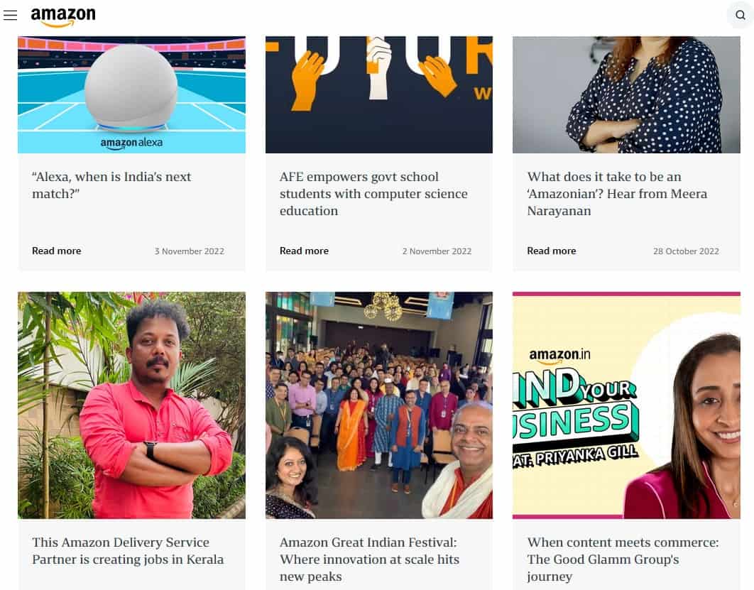
In fact, when I checked the About us section of amazon.in, they are mostly promoting their latest offers although, when you scroll down, they talk about the various community initiatives.
Even on Amazon.com, they seem to promote their latest The Lord of the Rings (it is being broadcast on Prime video at the time of writing this) series aside from some press releases.
The about us section on some websites also appears as “Our company”.
For example, Coca-Cola.com has an “Our company” section.
On their our company section instead of telling the story of their origin they talk about their employees or the top management, they talk about the various “human” and “environmental” initiatives they are taking.
They talk about how they manage waste during production.
They talk about creating a sustainable future.
They also showcase how they encourage diversity, inclusion, and equal opportunities at their workplace.
Does this matter? Definitely.
According to a Salesforce study, 86% customers believe that businesses must be more proactive in their roles towards societies, especially after the pandemic.
62% customers stop doing business with companies whose values are not aligned with their values.
Your about us page is the perfect place to share your core beliefs, philosophies, and values with your visitors and let them know where you stand on important issues.
What are the basic elements of your about us page?
What to cover on your about us page?
You can talk about your office environment – how comforting and inclusive it is.
You can list your team members along with the photographs and small statements from them. If you are a large company, then of course it won’t be possible to list everyone, but you can showcase your top management.
You can explain processes – how you execute projects. What are the various processes you follow to optimize your performance? How do you ensure your customers are easily able to buy from you and derive maximum satisfaction?
As written above, most of the about us pages talk about the core values of the business, the philosophy, and the mission statement. These don’t have to be long. Even a single sentence would suffice as long as it fully represents what you want to convey.
What about the history of the company? Is it relevant to customer and client satisfaction? If yes, then definitely tell the story of your company – how it came to be and what makes it what it is right now.
Doing some social good within your community? Don’t forget to mention that. Making donations? Definitely mention that. Are your employees involved in social welfare activities? Showcase their work, possibly with videos and photographs. Have a social media presence? You can embed the most successful updates on your about us page.
Listed below are the key elements of a perfect about us page:
Headline: Hook your readers immediately.
You can capture the main essence of the product or service that you provide in the headline. For example, is an SEO company your headline can be
“We achieve for you higher search engine rankings for toughest keywords”
What is the biggest benefit of working with you?
How does your business change people’s lives?
Is your about us page really about your company?
Let’s be frank: those visiting your about us section are not your acolytes.
They are least worried about your accomplishments unless those accomplishments have something to do with what you intend to deliver.
Whereas the accolades you have accumulated over the years can certainly be reassuring (that you are a company of repute and performance), what people want to know is
- How you’re going to serve their needs.
- Whether your values align with their values.
- How you have served your present and past customers and clients.
- What is your company culture.
- What is the attitude of your top management as well as your employees.
- What sort of atmosphere you maintain (you are inclusive or not)?
This Search Engine Journal blog post says that you shouldn’t spend much time on rambling on about your back story when writing your about us page.
They want to know less about your past and more about your present and future.
Take your own example: when you find an Amazon link while looking for a mobile phone you don’t want to know how Jeff Bezos started Amazon (maybe another day) – you want to know how the website is going to help you find the best model for your need, how the model is going to be delivered to you, and how it is going to be replaced in case you don’t like it.
Is an e-commerce about us page different from the about us pages on other websites?
There are about 20 million e-commerce websites worldwide. The valuation of the e-commerce industry is $ 5.5 trillion.
With so many websites to compete with, how do you create a contrast so that people can recognize your e-commerce website, and not just recognize, but agree to do business with you?
Want to distinguish yourself from other e-commerce websites? Your about us page can help you with that.
For an e-commerce website, your potential customers will visit your about us page to know why you are passionate about the products you are listing on your website.
To make people spend on your website, you must sound authentic and build trust and loyalty among your customers.
When they buy from your e-commerce website, they should be convinced that they will receive the item in impeccable condition and if they need to return it, they will be able to do so without much hassle and without spending money.
You can cover this on your e-commerce about us page.
What makes your about us page awesome?
7 tips for crafting a perfect about us page for your website
There are some standard elements that exist on every about us page. In fact, these attributes and elements are so common that even unconsciously, people are looking for them when they visit your about us page. Nonetheless, you can also make your about us page unique to include an element of surprise. Listed below are 7 tips that can help you craft the perfect about us page for your website.
1. Avoid the sales pitch
The purpose of your about us page is to give a glimpse about your company, your employees, and other aspects of your business.
Of course, every web page on your website exists to help you generate more leads and business opportunities and the underlying purpose of your about us page is also to help you sell more, but this should be achieved through engaging information instead of directly asking people to buy from you or do business with you.
Therefore, avoid sales pitch on your about us page. It can have CTA but it should naturally flow with the context of your about us page.
2. Make sure your about us page stands out
You can use engaging visuals. You can create a layout that is different from other about us pages.
Don’t make an about us page unique simply for the heck of it – it should represent the ethos and the personality of your overall website and business philosophy.
An increasing number of organizations these days showcase the various activities happening at their premises instead of simply talking about the history or the values of the company. They show their employees indulging in fun activities and learning engagements. They publish photographs of workshops and orientation programs. If they participate in social welfare activities, they publish videos and images about those.
Publishing testimonials can also help your about us page stand out but quite often, websites have dedicated testimonials web page. If you don’t have it, you can publish some stellar testimonials on your about us page.
3. Tell your brand story
Tell your visitors why your company exists. How it came to be. What are the events that led to the formation of your company – you solved a problem for yourself and based on that you created a solution that you could offer to the others.
Stories are always engaging. Weave a narrative.
4. Update your about us page regularly
There are multiple benefits of updating your about us page regularly. New things are constantly happening in your office and people would like to know about them and the about us page is the perfect place to talk about that.
When you regularly update your about us page it gives a reason to your visitors to check it out regularly. Awaiting your about us page is also good for your search engine rankings.
5. Make it about customers and clients
Although above I have mentioned that avoid using sales pitch on your about us page, ultimately, every page on your website is about customers and clients, and your about us page shouldn’t be an exception.
What would your customers and clients want to know on your about us page? What information would enrich them in such a manner that they would like to do business with you? What can help you establish a relationship with them? How do you convince that your corporate values match with the values of your customers and clients? How do your business practices benefit your customers and clients?
6. Include your values, mission statement, and vision
On almost every web page you come across these three sections: values, mission statement, and vision.
Take the opportunity to tell your visitors what you stand for through your values. You believe in an inclusive environment. You stand for the environment. You value peace and prosperity for everyone in the world.
Your mission statement tells your visitors what you intend to achieve for them through your business.
Vision is normally long-term – how do you see your business after five years? It represents your long-term goals.
7. Include a strong CTA
The CTA doesn’t always have to be “Buy from us”. You can prompt people to download your e-book. You can ask them to subscribe to your email updates. You can send them to another web page with more information about your company. Ask them to do something so that they stick around.
Examples of awesome about us pages
Let’s have a look at some great about us pages from different businesses and companies. I will also tell you why these about us pages rock.
Intel
In case they haven’t changed it, you can view the complete about us page on the Intel website.
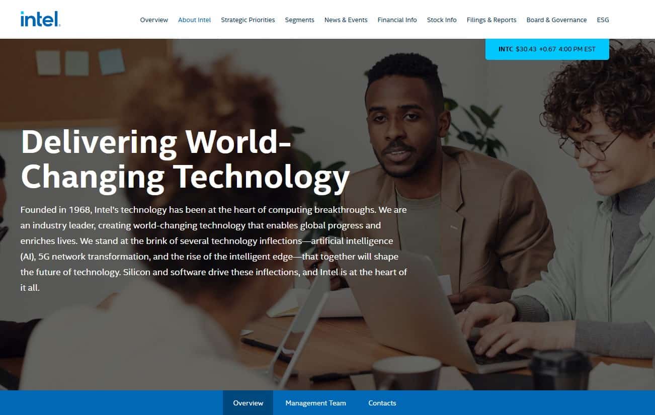
I like this about us page because it gives all the necessary information in plain language. Look at the headline that says:
Delivering World-Changing Technology
Then in a short paragraph it describes how Intel has been an industry leader in creating world-changing technologies since 1968.
When you scroll down, you come across the financial status of Intel.
Throughout the page they explain different technologies they are influencing, and they even talk about their products.
In a separate tab, you can read about their management team.
This is a very straightforward about us page. In different sections it explains different aspects of the company. It talks about innovation, it talks about leadership, it talks about technologies, and even evolving culture. They don’t try to be brief. At the same time, the page doesn’t seem cramped. It is a professionally designed corporate about us web page.
Interestingly, I had to search for “Intel about” to find Intel’s about us page. I couldn’t find it in their official navigation.
The same is the case for the next about us page.
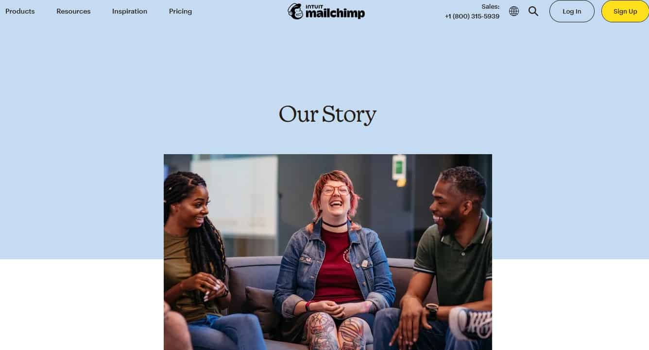
Mailchimp
You can see the complete about us page on the MailChimp website.
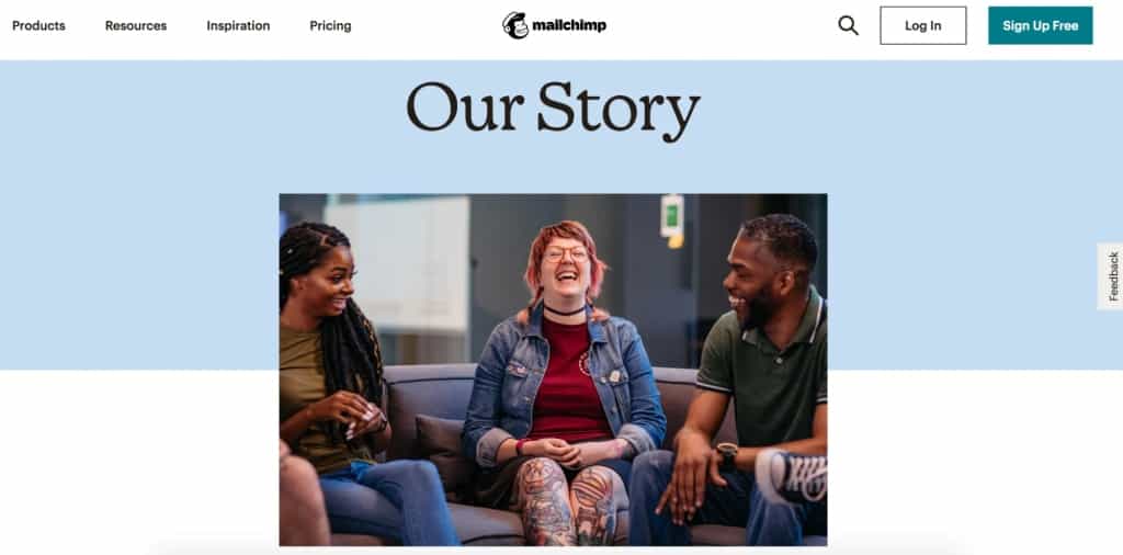
I have chosen this about us page from MailChimp because it is a quintessential page. There is nothing outstanding about the page. It’s quite straightforward. It talks about employees. It tells you the founder story – how MailChimp came to be.
Since serving small businesses is their primary forte, they talk about how they are streamlining their operations to better serve small businesses in multiple domains including creating product pages, landing pages, social media updates, and of course, email marketing.
They also talk about the investments they are making helping small businesses grow. The about us page talks less about their products and features, and more about the motivation that drives them. This is the kind of about us page I would like to write.
Zoho
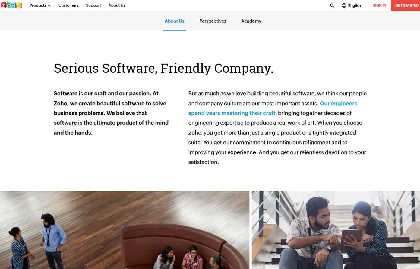
Here you can view the complete Zoho about us page.
Zoho has a very straightforward, but comprehensive about us page and that’s why I have chosen to showcase it here.
I like the headline:
Serious Software, Friendly Company
Then they explain how they create beautiful software to solve business problems. While talking about their work culture and the quality of their software engineers, they also talk about how great their products are.
As you scroll down, you read that they spend more on product development and customer support and less on sales and marketing. This tells you about their business approach. They don’t believe in up-selling. They don’t even force their customers to sign a multi-year contract. They are assured: since they are constantly beating their competition, they know that their model works.
This is a nice mix of promoting their products and talking about their company culture.
They also talk about one of their biggest strengths: they have kept the company private despite all the pressures. They have their own Zoho Schools of Learning, and 15% of their engineers come from this program.
They talk about customer privacy. They talk about their campus. They explain how their products meet almost every business need.
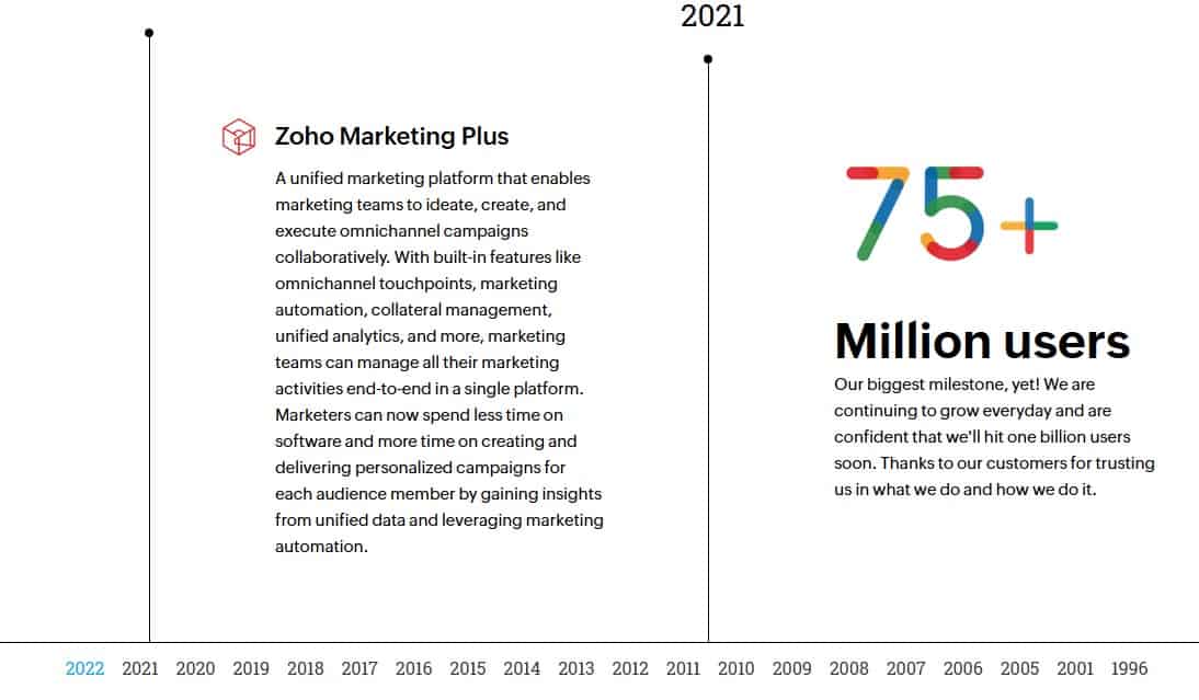
In the bottom of their about us page they have a complete chronology right from 1996 up till 2022 telling the entire story. As you click different years, you can read about related phases of the company’s development.
WordPrefistsss
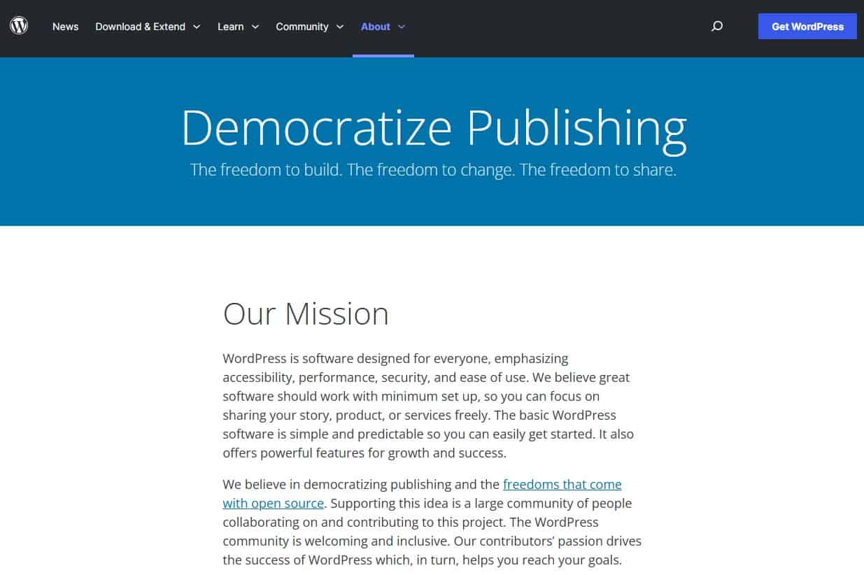
The WordPress about us page begins with their mission statement, appropriately because it is a free source-open source software company with a mission to “democratize publishing”.
It’s a very unimpressive page so why have I chosen it? Being WordPress, they could have chosen the fanciest of layouts and could have gone on and on – after all, they have been providing publishing software for almost 2 decades now – but still, they stay to the point because that’s what the audience wants.
They have kept their about us page minimalistic. Instead of having lots of information on the same page, they have linked to features, history, philosophy, testimonials, accessibility policy, and other details. Everything you want to know about WordPress, without beating around the bush, is on this web page. Easy navigation. Lots of white space. No extra graphic.
Band
As they say on the web page, Band is a creative design studio. Like any other creative design agency, they are majorly focused on showcasing their works. The web page loads quite fast, but it is full of graphics.
Sticking to the contemporary design ethos, they have used lots of white space to make it a relaxing browsing.
What I like about the Band about us page is that they have balanced visual and textual information proportionately. They aren’t solely relying on the visual presentation of their portfolio.
They use very simple language. In the headline they say
Band is a multidisciplinary creative studio.
If you’re not sure what “multidisciplinary” means in this context, you can read further. It sparks curiosity and in a way, prompts you to read.
The language is quite simple and yet professional. Without using fluff, they tell you that they “design, create and produce work” they are proud of. They also let you know that they take on only those projects they believe in, which shows conviction and sincerity. They work in a “wide range of creative disciplines”.
When you scroll down you can read about company history. There are no specifics. Just about how the founders met and then how they got together to form the creative studio.
Very little info, but enough to give you a sufficient idea of what the company is about and how they approach individual projects (projects they feel about).
Buffer
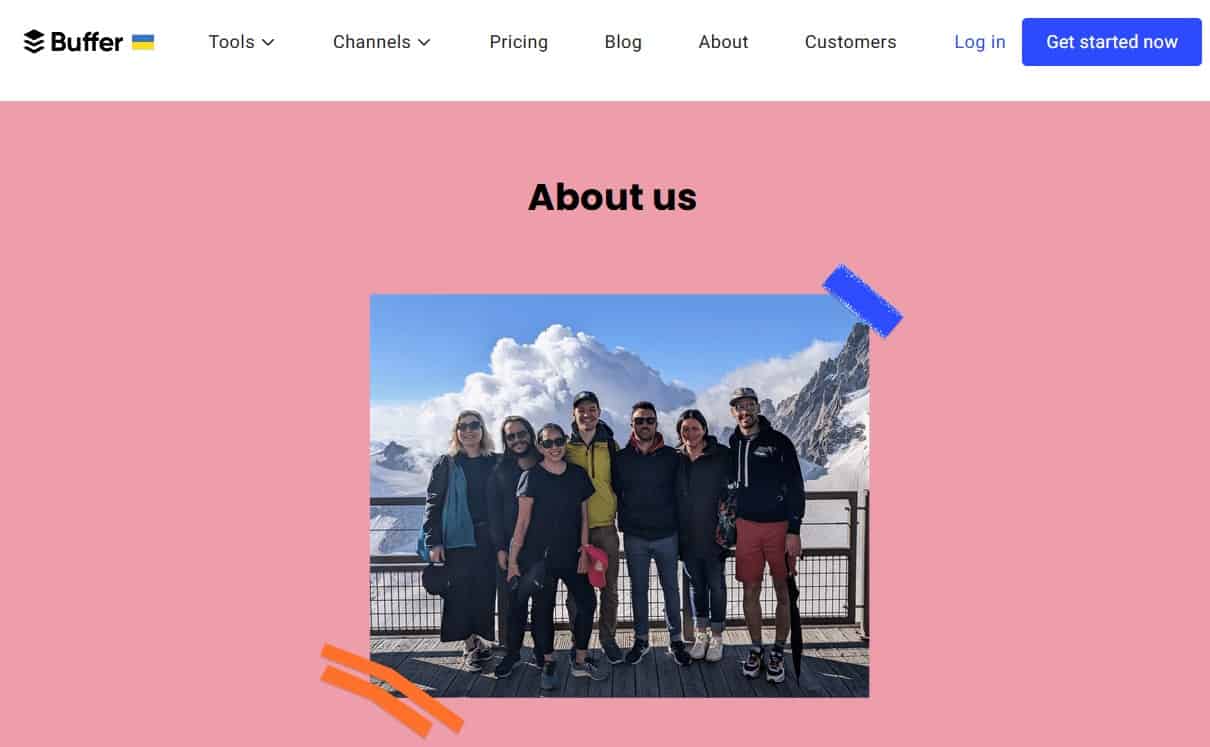
You can scroll through the complete Buffer about us page here. They have a very simple, linear about us page with no earth-shattering headings. They display no unique “attitude” – they have simply explained what Buffer does, in which countries they have their employees and how they help their customers manage social media accounts.
 The unique thing about their employees’ profiles is that they also tell you how much each employee is making.
When you scroll through their about us page you will notice that the format of their about us page is like a typical home page. They talk about their work. They have a ticker the way many homepages have these days. They display the logos and names of the companies using Buffer.
Their Our values section is quite comprehensive with subheadings like transparency, positivity, gratitude, reflection, consistency, and stretching themselves beyond their limits. They openly claim that their salaries and salary formula are publicly available. You can also get a glimpse of their product roadmap – where they’re heading.
A wholesome about us page.
Why have I chosen these about us pages? They may not seem unique.
As a content writer my primary focus is communicating the message. I don’t believe in bells and whistles although, I’m not averse to the idea of creating fancy and “unique” about us pages. Somehow you must be sure of what you want to put on your about us page. As long as the surety is there, it is up to you what type of about us page you want to publish.


